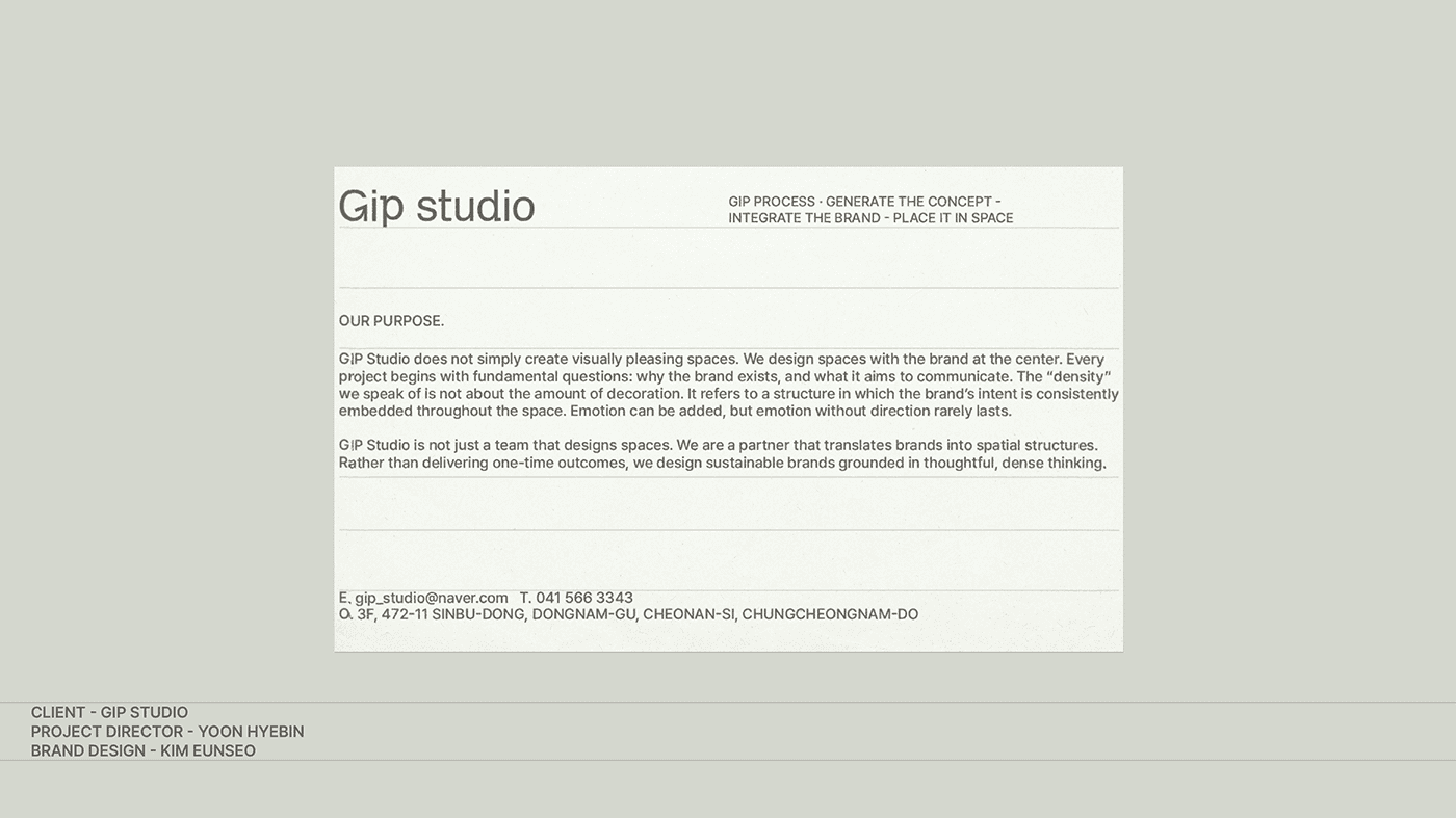
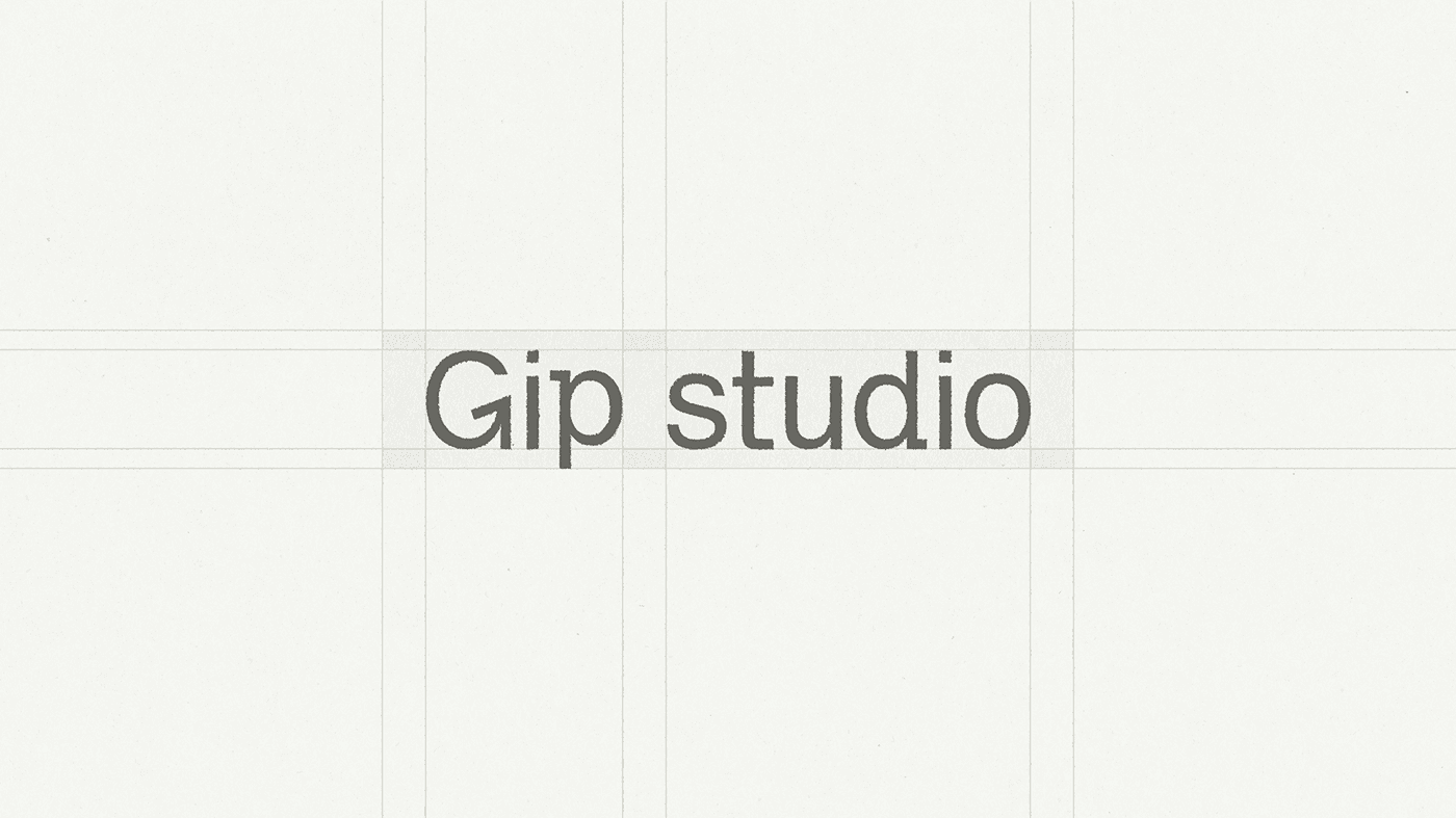
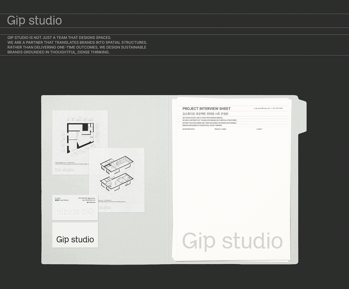
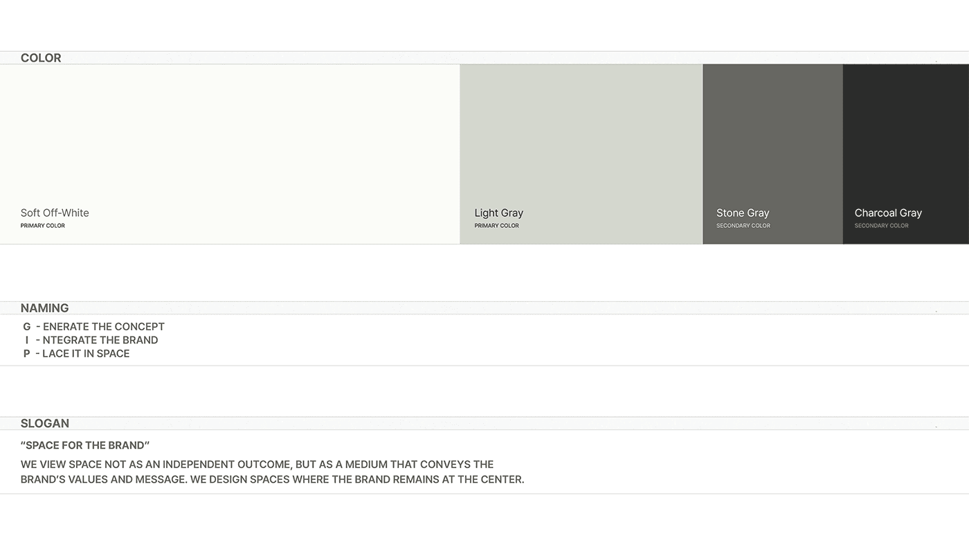
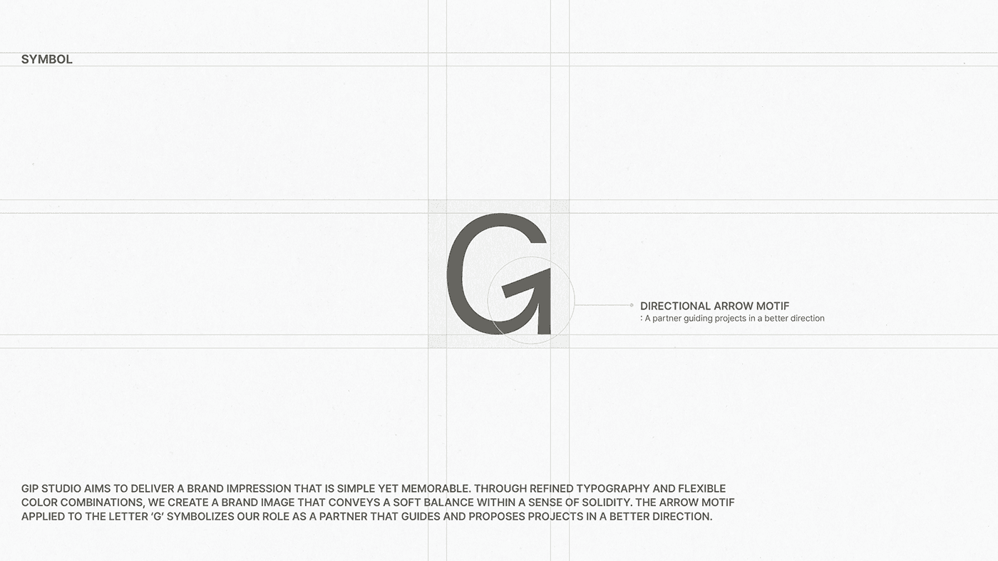
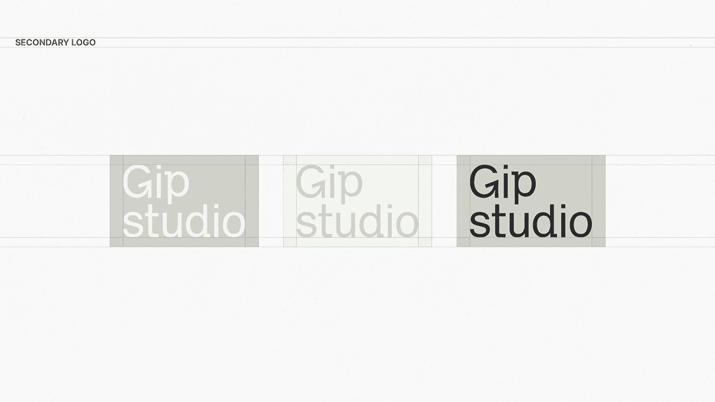
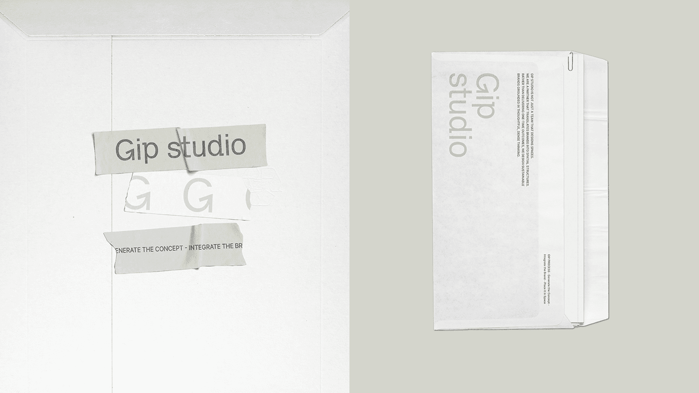
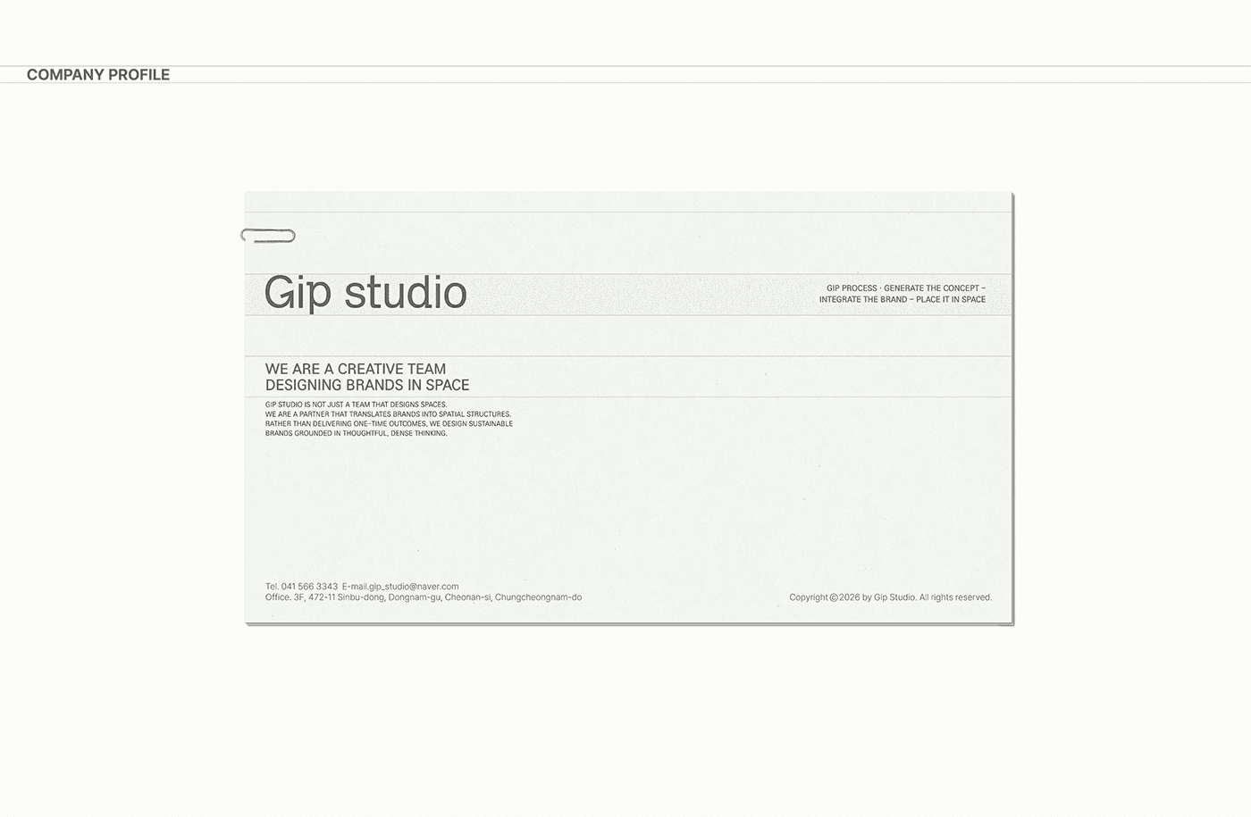
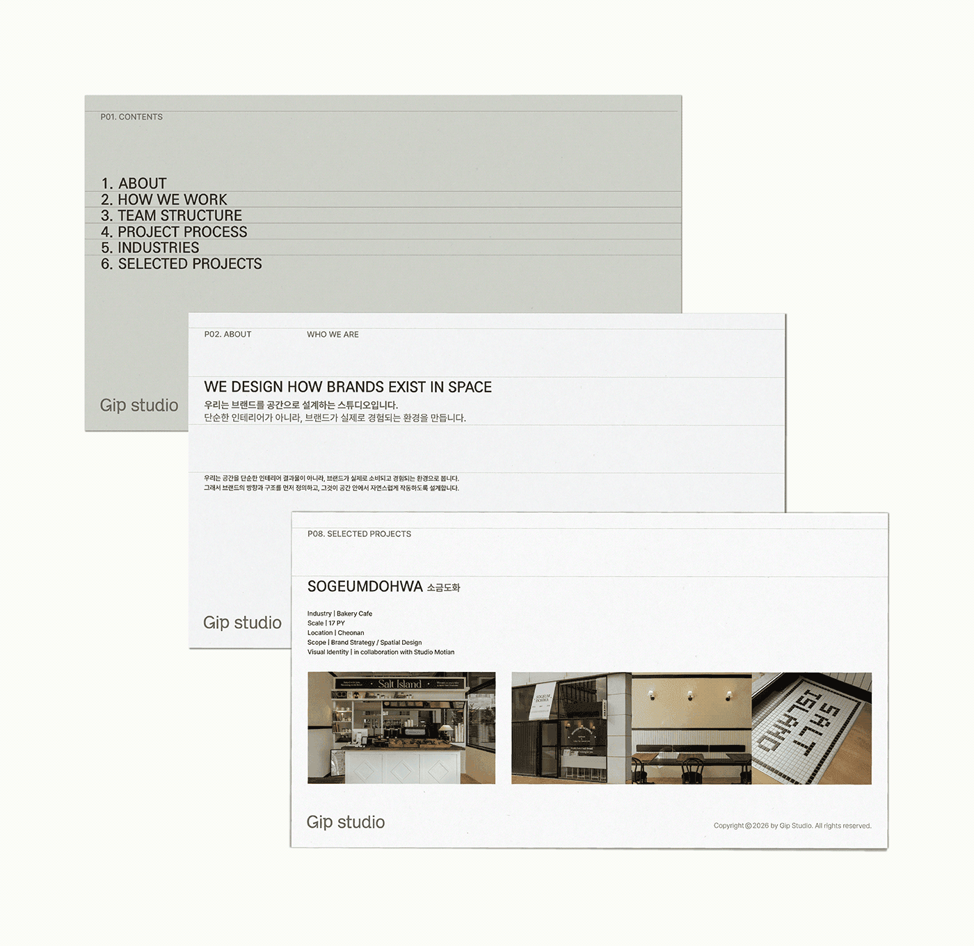
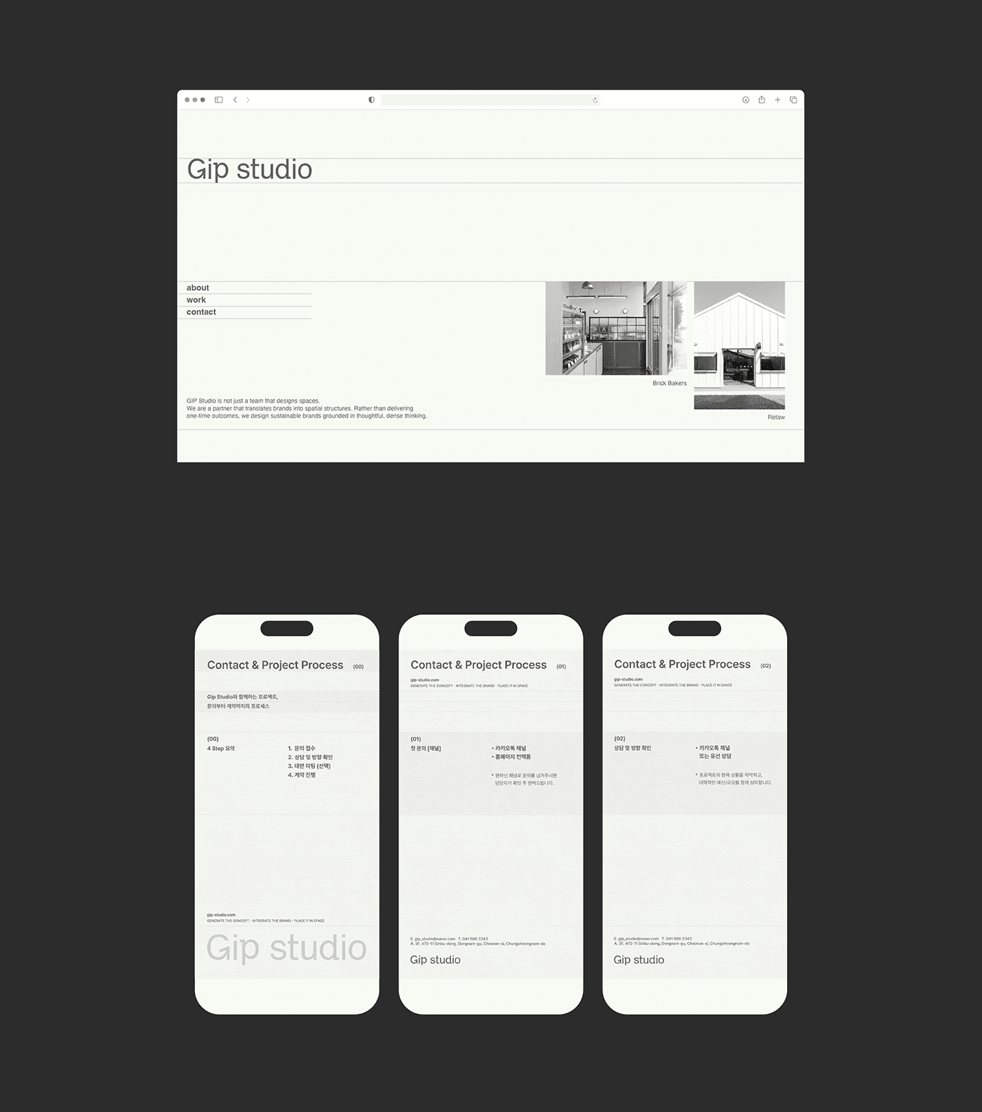
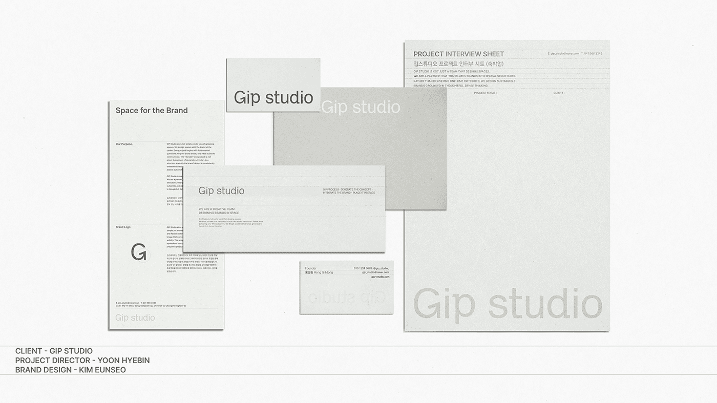
This is a rebrand of GIP STUDIO, sharpening its identity as 'a team that translates brands into space'. Rather than visual decoration, the focus is on letting the brand's context read naturally and flex across different settings. A minimal wordmark, refined typography, and a flexible color system build an identity that is solid and made to last.